
7 Actionable Tips to Avoid Making Linkedin Profile Another Resume
Learn how to change your Linkedin profile into a virtual shop or store and gain 2x - 3x engagement. These 7 actionable tips can change how your Linkedin profile looks.
If someone comes to your physical office or a store or a shop, would you greet him or her with goggles on? Or maybe by showing a picture of Steve Jobs or a motivational quote? No, you won’t.
You would welcome them with a smiling face and a courteous look.
How would you like your customers to locate your physical address? Would you confuse them by putting too many landmarks or building names? No, you won’t.
You would write the address concisely so that customers can easily locate and visit your office or store.
Also, how would you advertise your products or company to the walk-in customers in a physical store? Would you brag about yourself without listening to them? No, you won’t.
You would be more interested in listening to people’s problems and projecting yourself as their problem solver.
Think of your Linkedin profile as a virtual office/ store/ place of business. It is not just a resume; rather it tells your story to the outer world.
Let’s analyse the above points in the light of Linkedin to uncover the hacks for making a profile perfect -

Use the right format for writing content
Don’t write your name in all UPPERCASE or all lowercase letters; capitalise the first letter of each name while keeping other letters in lowercase.
Content in the summary section should ideally be written in sentence case - capitalising the first letter of the first word only. For the headline section, you can again capitalise the first letter of each word.
Choose an appropriate profile picture
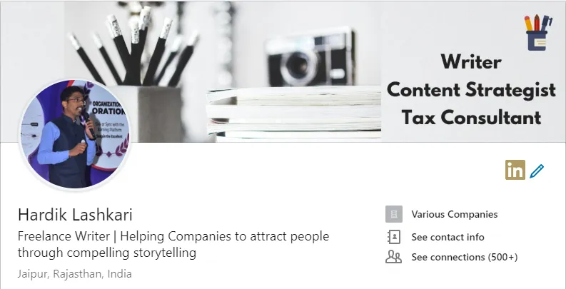
Upload the best photo of yourself, but remember, it should be appropriate and professional (i.e. not a selfie). Also, don’t upload a picture of a celebrity, a motivational quote or a picture you would rather choose for a dating site.
Design a background image
Your background image is the first section that everyone sees while viewing your profile. You can choose this section to give a glimpse of your services or an appealing moment in your life. You can design a background image in just a few minutes with Canva (easy as a pie).
Customise the headline
By default, Linkedin uses the current job title as the profile headline. However, you can create an enticing headline to attract more profile views, since it is the only piece of information along with profile photo and location, visible to a person during search results.
You can break down the headlines in two or more sections by separating them through “|”. The first section should talk about who you are; your second section should talk about how your services would benefit people.
Whenever a person visits your profile, he wants to know “What’s In It For Me?”. The second section of your headline must answer the WIIFM so that people can spend time reading more about you and your work.
Follow me on Linkedin to read more such actionable tips to optimise your profile and increase the Linkedin experience.
Sell yourself in the summary section
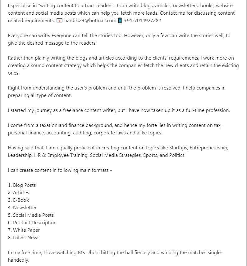
Your primary objective, while writing a summary section, should be to persuade the profile viewers to hit the “Read More” button and read the entire summary.
Follow me (https://linkedin.com/in/hardiklashkariwriter/) on Linkedin to learn more such hacks and get 2x - 3x value addition from the most trending platform right now.
For this, first 3–4 lines should be captivating and display your USP (Unique Selling Proposition). Also, you can add your contact details (Email ID and Phone Number) for people to contact you in case they want to take the conversation forward.

Your next objective should be to make the summary section as interesting and a walkthrough of your achievements, professional experiences and thought process.
Also, there has been a lot of discussion about the “First Person” or “Third Person” approach in writing a Linkedin profile. First or third-person approach doesn’t matter as long as you can communicate your story in a compelling manner. Stay consistent with whatever you choose and stick to it till the end.
Also, ensure that rather than writing 2 long paragraphs of 6–7 lines, you should break the summary in 5–6 paragraphs of 2–3 lines to make it look more readable.
Personalise the public profile URL
By default, Linkedin combines your name, some ugly looking numbers and a weird combination of special symbols to create your Linkedin profile URL. However, you can customise to keep it consistent with other social media platforms. A simple and effective way is “http://www.linkedin.com/in/yourname”.
Search Job descriptions to see relevant skills
If you go in the Job section on Linkedin and search for a job related to your industry, you would find many jobs listed there. Click on those jobs one by one and analyse the skills mentioned by the recruiters. If you don’t find one of those skills in your profile, you know what to do - Add those skills instantly to find better prospects.
Remember, people see what you show them - Make your Linkedin profile marketable to get maximum benefit from Linkedin.


