Web Design Trends Every UX Design Firm Must Be Aware of
Every year, we come across numerous trends and strategies that emerge in the market while outdating the existing trends. Few trends come and go, while others remain in the industry for a longer time while gaining the customer’s appreciation. And when we talk about the evolving trends in the web design industry, it becomes important for each and every UX design firm to be aware of the popular web design trends.
Popular Web Design Trends
Earlier, the websites were only designed for PC views and that was acceptable and appreciated in the market. But with time as smartphones and other digital devices evolved, the demands for support of all devices emerged.
With this, the trend of responsiveness came into existence. So, every day, older trends become obsolete, while new ones gain the spotlight. Underneath, I am sharing the popular web design trends so that you are aware of the latest trends that are being practiced in the design industry recently. Let’s get started!
Splitting Screen Content
There are times when you wish to convey multiple things on the screen. In that case, the new trend is to split the screen down the middle, which allows multiple ideas to be displayed equally and grabbing the customer’s attention.
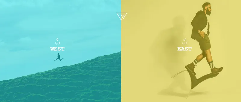
For adding visual hierarchy in the partitioned design, you can add one more element at the center of the screen; it could be anything like your business logo, menu header, or a CTA that balance out the screen partition.
Oversized Type and Elements
In recent times, websites are emphasizing and preferring large and prominent elements. This trend comprises of big and bold typography, oversized website menu icons, fullscreen images and videos, and so on.
Oversized elements are appealing and assist site visitors to get an idea of what the website is all about and it looks great on all screen sizes. For this to work out, you’ll have to minimize the design elements that are used on each page.
Ample Whitespace
Whitespace, aka negative space, is the blank space that is necessary nowadays between the design elements. Every page must have enough breathing space so that customers have a great experience while they browse your website. And whitespace doesn’t have to be of white color only; you can go for any background color of your wish.

It comprises of the spacing between lines or columns of text or the margins of the page. Nowadays, designers and business owners ensure that they have sufficient whitespace on the website so that the customers enjoy a great experience over your website.
Motion and Interactivity
Animations and videos are not new in the design industry and have been used on websites for quite a while now. But now, adding motions and interactions is becoming popular as website visitors love going through motions rather than looking at still images.

So, grabbing the attention of your potential customers becomes easy and quick while going with motions on the website. Before adding motions on the website, the designers must invest a great time while planning the locations on the site where all the motions must be applied on the website.
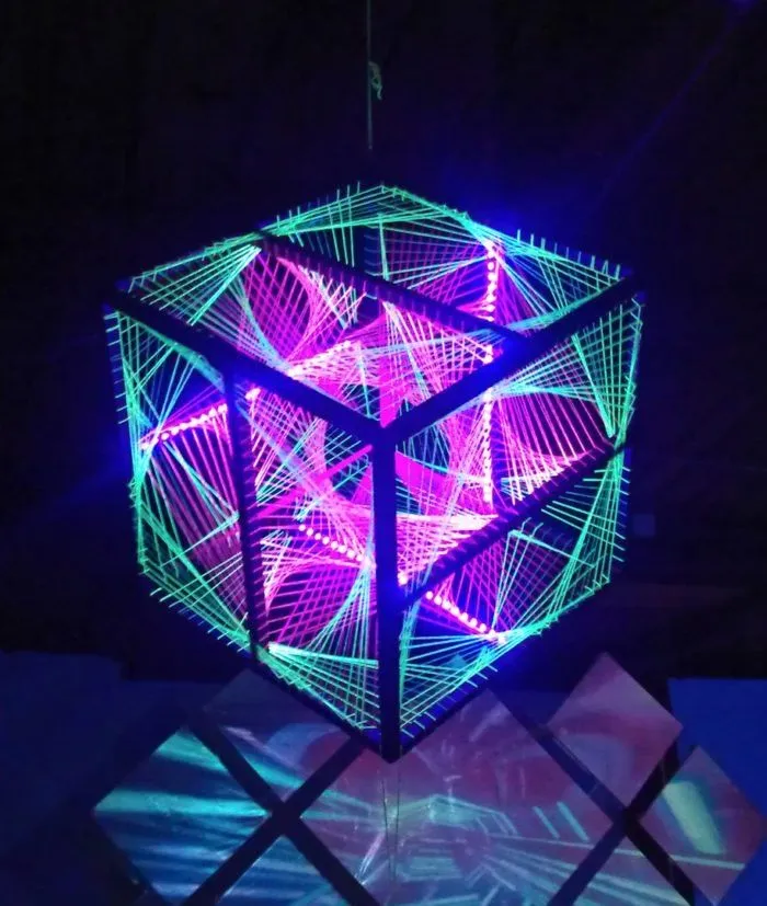
Fluorescent 3D Digital Artwork
With the growing trends and customer demands evolving every day, users expect more appealing experience from a website. With this, fluorescent 3D digital artwork is gaining the spotlight that helps to grab the attention of a wider customer audience while offering an appealing and great presentation on the customer’s end. This is not at all a new trend, but we can say that it has gained the spotlight recently and is expected to remain in the industry for quite a long time.
In the web design industry, the trends will continue to evolve as new and new strategies come into existence and customer demands grow. Till then, consider all the above trends on your website, and this can help you build a strong UX design portfolio as well so as to grab wider customer engagement.
So, try implementing all these design trends in your website so that you can gain a competitive edge over the competitors and draw the attention of your potential customers.


