Hero Image: What it is, why your website needs one, and how to select the best
You must have noticed how some websites feature a large image right below the navigation bar and the rest of the webpage content. This is nothing but the hero image. Wikipedia defines it as "a large banner image, prominently placed on a web page, generally in the front and centre." The hero image can be static or dynamic (videos and animations) and it typically covers the full-width of the webpage.
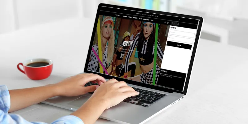
Image : shutterstock
Why a hero image is important
A hero image serves several purposes on a website. Its most important benefit is that it immediately arrests a visitor’s attention. Since people respond positively to visual content, having a high-resolution image on your website is a good way to entice visitors to explore your site further.
A good design is an absolute must for every website these days. It is the first factor that influences a visitor's opinion of your company and plays an important role in increasing conversions. The hero image is a key element in web design. The right one can establish trust among visitors and make them interested in what you're offering, while the wrong one can drive them away.
Hero images are also extremely useful for directly engaging your site's visitors; you can display your company's USP, entice visitors to take a particular action using a CTA button, or ask them to sign-up for a service trial.
How to select the best hero image (with examples)
Selecting the perfect hero image for your website is a tricky task. The banner image you employ will vary depending on whether you're offering a product, a service, or simply content (blogs). If you want to offer in-depth details about your company, then videos can be used as well. But, regardless of what you want it to achieve, the hero image should always be in high-resolution. You should also optimise it to make sure that your site loading time isn't affected as it may dissuade visitors with a slow internet connection.
Of course, it is impossible to know outright which one will work the best, but narrowing down your options and then testing to see which one is the most effective is the best way to go about it. You can also use a slider to display multiple images at a go.
Here are a few examples of the different types of hero images to give you an idea of what you can do with them:
Focus on the product
Featuring a simple high-res image of your product along with a short copy is sometimes the best option for a hero image. Apple's website is an excellent example of using product images to appeal to visitors. They also make use of a slider to display three of their products.

Display benefits
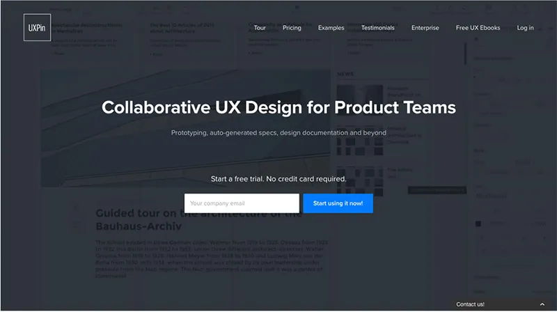
A hero image that focuses on a USP or value proposition is a good option for service-oriented companies. UXPin's website overlays their USP over a faded, dynamic hero image and gives visitors the option to instantly start using their service without further ado.
Simple illustration
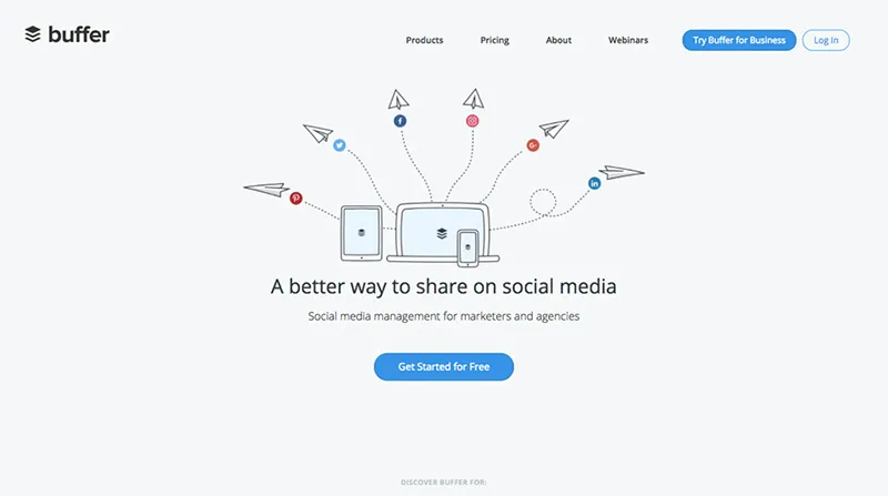
Using a simple and minimalistic illustration can be used to inform visitors of your company's offering without overwhelming them with information. Couple it with a clear copy and CTA and you have a winning strategy. Take a look at Buffer's homepage to understand what I mean.
Build trust
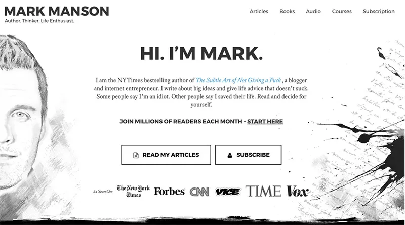
If you're running a blog, it can be quite difficult to entice visitors into reading your articles. You must give them a reason to do so, and a hero image can be hugely influential in making this happen. Mark Manson is a prominent blogger whose website works wonders in generating credibility, trust, and curiosity through the hero image. It also features his sketch for added measure.
The human factor
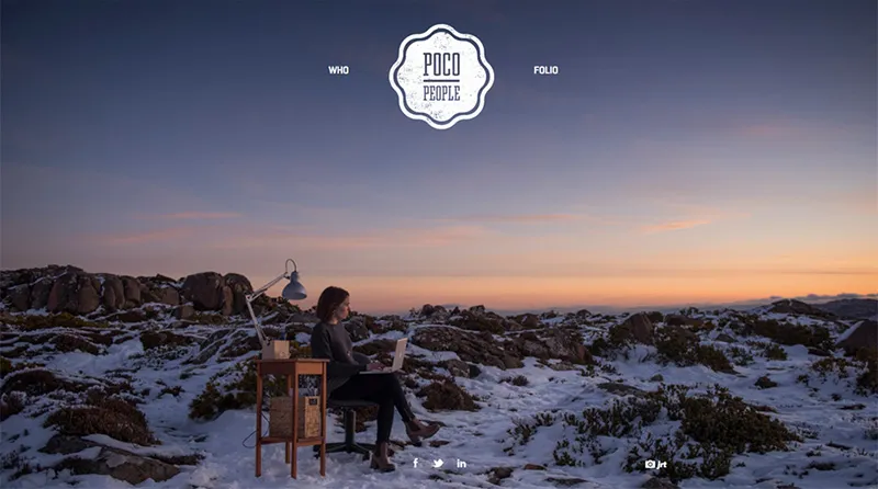
It's no secret that using real people in your visual content establishes legitimacy and trust among viewers. However, be sure not to use stock images as that tends to have exactly the opposite effect. Poco People is a website that best exemplifies this practice.
Evoke emotions
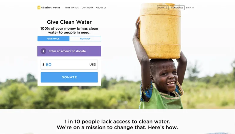
If you can use your hero image to make your visitors feel, then there is a higher chance of them complying with your request to take a particular action. Charity: water is a non-profit organisation that makes use of donations to supply safe drinking water in developing countries. Their hero images clearly exemplify the positive impact of a donation.
Once you've shortlisted a couple of options for your hero image, you can zero-in on the perfect one for your website using A/B testing. And remember, your image should blend in seamlessly with the rest of your webpage design and it should also be optimised for different screen sizes like mobile and tablet besides desktops.


