How your resume should look in 2017
Six seconds. That’s all the time you have to get your potential employer interested in taking a second look at your resume. We have all heard this statistic, haven’t we? The number changes a bit here and there, but from studies conducted all over the world proving it time and again, we can be sure that we have very little time to make an impression. As job seekers, what does this mean to you? It is a clear indication that it’s time to ditch the obsolete parts of your resume and pump it up keeping in mind the trend of your times. So here are a few tips you need to remember before sending out your resume:

Image : shutterstock
The robots are dead (or dying)
One of the main tips that were doled out earlier on the top of resume writing was to include keywords and buzzwords. This was to get past the infamous ATS (or applicant tracking software), which scan the many resumes that reach the inbox of the HR manager and let only ‘specific’ ones pass through. So, the probability of a worthy candidate’s resume being rejected because of the lack of keywords was high. However, most companies are now moving away from such systems as they have identified its shortcomings. So, you don’t need to beat the robots anymore. Be honest and precise about your skills in your resume.
Make it visually appealing
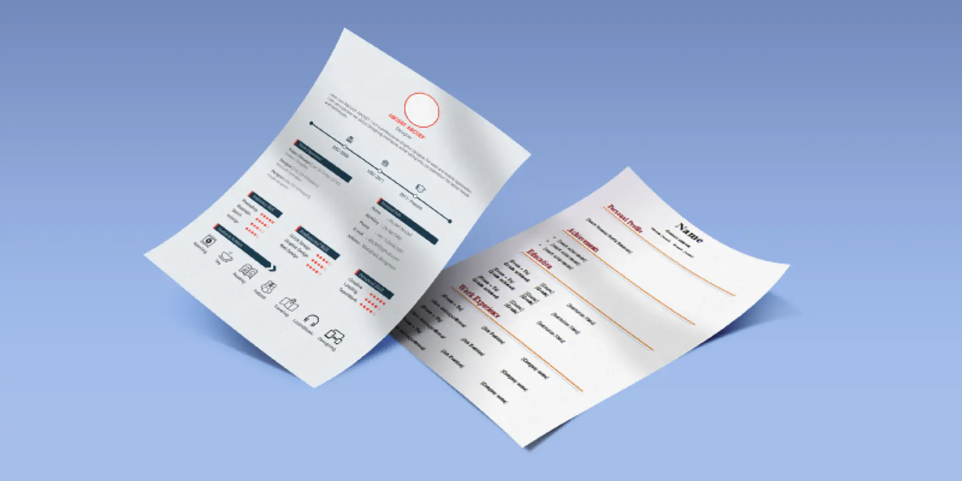
Given that the scare of robots does not apply anymore, it’s safe to make your resume as visual as possible. Infographic and multimedia resumes seems to be the new rage now, with candidates in creative fields like design, film, creative writing and digital marketing embracing it. Take a look at these 40 infographic resumes to see what we mean. They showcase your creative skills, personality and experience all in one go. While there are many recruiters who feel that such resumes should not be the primary one you use to reach out to employers, others encourage using it if it fits the job role you are applying for. It is logically more likely for a quirky startup to be interested in a creative resume. Lisa Andrew, owner of Red Sapphire Consulting, told Forbes about an origami resume she received 12 years ago. The resume came with “instructions on how to configure her resume. I followed the directions, which were 100 per cent accurate, and it turned the resume into one of those folded paper games from the 80s. Each square of the fold had the pieces of her resume.” And, of course, she was hired. If you are from a field that does not encourage such extreme creativity, just add some colour to your resume to liven it up.
Ditch the objective
It’s 2016, and no one has the time to care what you have regurgitated in the form of ‘career objectives’. Recruiters have realised the pointlessness of these objectives after hearing every candidate state that they want to “use their skills to contribute meaningfully to personal growth as well as that of the organisation”. Instead, what they want to see upfront in your resume is a summary of your experience and skills. Keep it short and precise. Writing it in bullet points is even better. It should convey the number of years of experience you have, your job history and your big career achievements. This is all the information that an employer needs to have before he or she decides whether to read your resume further or not. So, include all the relevant information, but remember that this is just a summary of your profile.
Easily accessible contact information
We would suggest that you start off your resume providing relevant contact information. Don’t make hiring managers hunt your resume for your contact in case they need to call you for an interview. On an online resume, make sure that you hyperlink your email id and, it goes without saying, include all social media profiles that are relevant to the application. LinkedIn is the first on this list, followed by Twitter and the rest. However, resist the temptation of including all your profiles, because while creative designers may need to include their Instagram and Behance profiles, accountants and engineers may not. As we warned you earlier about dying ATS, what is replacing them are such social media profiles. So keep these profiles up-to-date and be active on them.
Titles and fonts
Your resume may not get read word to word by the employer. So make sure you have highlighted what you don’t want them to miss out on in case they choose only to scan or skim through it. Keep such position titles or phrases in bold, so that even someone who glances at your resume gets a full picture without having to read what is written under every point. Ditch traditional fonts like Times New Roman, Arial and Courier for more modern and chic fonts like Garamond, Cambria and Calibri. The standard font size can vary from 10 to 12 point for the body, with larger sizes acceptable for headings or subheadings. Always remember that different people may have different font settings on their computers, so it’s best to send a resume that has uncommon fonts in PDF format so that the appearance is not tampered with.
Resume trends are ever-evolving and you need to keep updating it every few months with newer skills and according to latest trends. In a few years, maybe social media will do away the need of a resume as such, but till then, these tips will help you impress your potential employer.


