How to make your site user-friendly while boosting SEO
Many Search Engine Optimisation (SEO) specialists, content writers, and web designers think of on-site SEO as distasteful, user-hostile work. However, I believe SEO can actually improve the user experience when implemented correctly.

It requires a paradigm shift in the perception of SEO. You must shed outdated SEO concepts such as keyword stuffing, and getting massive amounts of (irrelevant) backlinks etc. An SEO strategy built on top of these tactics is no longer sound, and leaves a bad taste in everyone’s mouth.
This is because Google has come a long, long way since it became everyone’s search engine of choice in the early 2000s. Search is now smarter, faster, and - more importantly - human.
Yes, Google Search’s more recent smarts come partly from its ability to think like a human. Thus, the most effective, modern SEO tactics should lead to great human experiences.
In this post, we’ll be covering a handful of what I believe are the best user-friendly search engine optimisation tactics. Let’s jump right in!
Design scanning-friendly pages
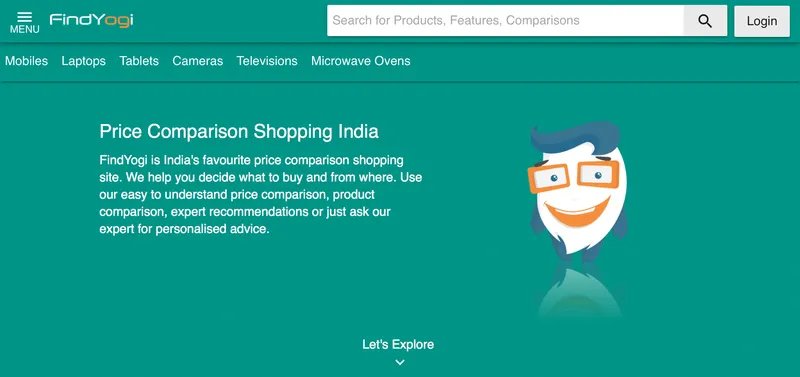
When you’re creating a web page, you often have a particular keyword in mind for which you want to rank for. To help both users and search engine spiders understand this easily, place your primary keyword at the beginning inside a heading tag.
It’s a mistake to think people read every single word on your website. Instead, they skim and scan to find valuable information. By putting your keyword up top in a heading, you make it easier for them to do this naturally.
Indian price comparison service FindYogi.com’s homepage is a good example of this. They write 'price comparison shopping india' right up top to make it instantly clear what they’re about. If a marketing person were responsible, they’d use something like 'make great buying decisions' or 'shop smartly' which is relatively ambiguous. FindYogi is a well-designed price comparison service - much of their work serves as inspiration for my own Pakistani price comparison service.
There are more ways to help users scan your page:
- Use bullet lists: Just like real people, search engines give special importance to lists when parsing Use them to highlight important points.
- Bold important content: Thicker letters immediately stand out from the rest of the page, and are thus a great way to, again, highlight important points. You can also combine this with italics but be sure to use both sparingly.
- Use action keywords in links: When you add call-to-action keywords in links, you inspire people to take action now while informing search engines of what lies on the other side.For example, if are you were linking to YourStory’s community section in an article, it would perhaps be more effective to use “Learn from YourStory Community’s insights” rather than “YourStory Community.” Which would you be more likely to click right now?
Did you see what I did with this section? I applied all three points in the list above to make this article scanning friendly.
Begin meta titles with the primary keyword
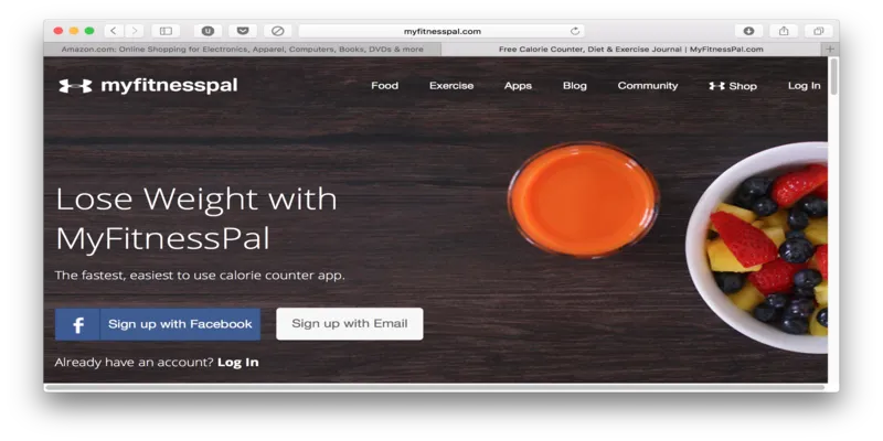
The <title> tag forms an important part of your page’s first impression to both readers and search engines. Yet, I’ve seen far too many content writers and developers pay no heed to it, as they believe people simply don’t read the title anymore.
This is completely false. The title is front and centre in many places including the tab bar, search engine results, and when people share a page on Facebook, Twitter, or WhatsApp.
When people have multiple tabs open - as is common these days - each page’s title will help them understand what content they’ve opened previously. They won’t have to open and scan each tab again to remember its purpose.
With this in mind, it is recommended your meta titles include keywords at the start - written in passive voice - and keep your brand name at the end. Users will instantly understand what said tab is about, while making it easier for search engines to rank you for your target keyword.
MyFitnessPal.com (above) is a good example. I’ve also shown Amazon’s homepage to clarify that these are recommendations - not strict rules. Amazon is such a huge brand name that it serves users better to have ‘Amazon.com’ at the start of the title. I myself am experimenting using a different kind of title on my personal projects, and will share insights based on my learnings.
Optimise all images
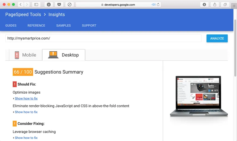
It’s disappointing how almost no website truly optimises their images. It takes just under a minute to do so once you’ve made a workflow, and the benefits are immense! This is especially because there is a decent chance your competitors aren’t optimising their images, which helps you stand out to both Adam and algorithms. Here’s what you need to do:
- Compress your images: Using a tool like TinyPNG or TinyJPG, you can dramatically reduce the size of your images without any noticeable reduction in quality. Images are often the heaviest component of a webpage, so this positively affect your load times.Google openly recommends you optimise your images to improve user experience.
- Make them more accessible: Visually-challenged people use screen-reading software which read alt attributes to help them understand an image’s content. Search engines use them in combination with computer vision algorithms to do the same. You’ll benefit both by describing your images in simple English with the alt attribute.
The image above shows results of a Google PageSpeed Insights test on MySmartPrice.com. As you can see, Google’s #1 recommendation to improve speed is to optimise images.
Employ the power of internal linking
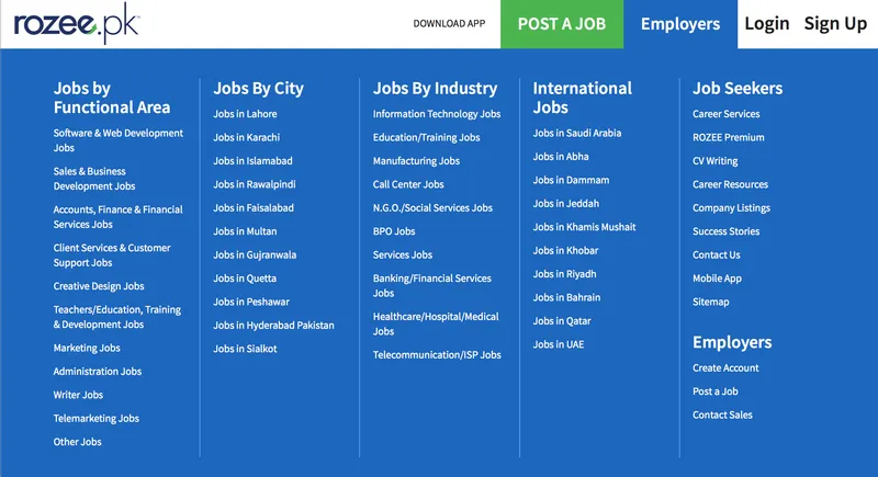
Linking pages within your website to one another helps search engines understand that the sum of your website is greater than its parts. Each page depends on the other to provide complete value to users.
This is why internal linking is rewarded by search engines. It increases the value of each page, and the website as a whole. Internal links include links in body text, links in the footer, links in the sidebar, breadcrumbs in breadcrumb navigation, and more.
As a reminder of tip #1: readers and search engines will benefit greatly when keywords are used in your links. The example up top is the footer of Rozee.pk - an employment website in Pakistan. This is exceptional SEO work, which also directly improves user experience.
Human-centered SEO
With the proliferation of personal computers, and advancements in machine learning, both users and search engines are becoming increasingly sophisticated. Thus, modern SEO specialists, copywriters, web designers and developers need to work together to build websites which put humans first. The core idea is simple: human-centred design wins over search engines, too.
(Disclaimer: The views and opinions expressed in this article are those of the author and do not necessarily reflect the views of YourStory.)


