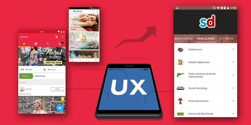
How e-commerce biggies are using good app design to improve revenues
A chartered accountant, 27-year-old Aziya Shahabuddin seldom has time to go shopping. However, she is grateful to the e-commerce apps that she installed on her smartphone, which have evolved to make her life easier. “Features like easy navigation, secure payment gateway, and similar products’ suggestion are important to me. But now it seems like they are careful in even choosing the colours which are easy on my eyes,” she smiles.
And she is right. Relevance of app design in generating revenue seems to have hit our e-commerce players.
Anand Chandrasekaran, Chief Product Officer of Snapdeal, says that India did not realise the importance of design until recently. “We only had product, engineering and management [teams]; we needed a data scientist and a designer. Thus, we created an entire family of analytics and design supplies,” he says.
Most apps are like the Sunday market; a good app is like a relaxed shopping mall. E-commerce is mimicking its offline counterpart in evolution, exciting new generation customers with innovations every day.

Personalisation
This is the key word for e-commerce apps. In fact, keeping the user engaged by showing content that is relevant to him/her – based on browsing and buying histories – has become essential for customer retention, conversion, and revenue generation.
Finding the relevant content among the millions of products in each platform can be a challenging task. Ram Kanda, CTO and Product Lead at online luxury platform Zapyle, says: “We personalise the app experience but keep it transparent, so that users understand we curate the content for them and also give them avenues to edit it. Our philosophy is to keep the user in charge of what they see on the app and not make them feel manipulated.”

Online jewellery retailer BlueStone’s personalisation of content also uses demographic data. “Native features such as mobile camera, location tagging, address book, etc., along with single user login can help personalise the entire browsing experience,” says Arvind Singhal, COO of BlueStone. They are also working on blog integration on the app for social syndication. Ethnic fashion seller Craftsvilla is also introducing personalised behaviour in their app, along with local language support and customised stitching support.
Feeding user interest
Customer feedback inevitably helps major decisions on app features. Fashion discovery app Wooplr uses qualitative and quantitative analysis to understand user response. In the former, they reached out to people who are currently active on the platform, inactive, and dormant. Ankit Sabharwal, Co-founder and CPO at Wooplr, says: “We requested them to come over to our office, and shop online to know how the things we have done are effective in the real world. For quantitative feedback, we found out how the larger user base is using our product.” This experiment has been beneficial. “A customer from Siliguri asked us if we deliver in that pin code. We ship everywhere; so we did not add a box saying shipping to your pin code is possible. We realised our mistake – Tier 3 cities’ users do not assume that we deliver there by default. They want to check before making up their mind,” says Ankit.
Fashion apps be all fashionable
E-commerce apps focusing on fashion ensure that their apps are fashionable too, by taking an effort on visual merchandising. For instance, BlueStone’s app focuses on providing visual appeal through product imagery – using latest 3D software and faster image refresh options.
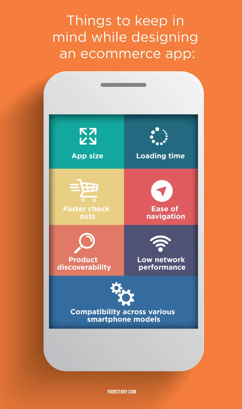
Manoj Gupta, Founder and CEO of Craftsvilla, says: “Our app initially was a simple one for listing our catalogue and enabling commerce. Later we made a lot of changes in discovery, image based recommendation, size reduction, image optimisation for low bandwidth networks like 2G, etc.”
Social interaction between users is another major feature in fashion app-commerce, as was proven by the likes of Myntra, Wooplr, and Roposo. Wooplr’s Ankit says that an entirely new interface takes time for users to adapt. But letting them post a photo by using an interface they are used to in Facebook puts them at ease. Zapyle is also planning to make their app more conversational. Ram says: “We are building content and community to drive engagement, and curating this content for each user to encourage them to consume it.”
Evolution: To each his own
According to RedSeer consulting firm, online retail sales via app have seen quarterly growth of 50 per cent in 2015. Although about 60 per cent of the entire industry’s business was done via apps till December 2015, their research found customer dissatisfaction on apps compared to desktop due to slow loading. “Discounts exclusively provided on apps cannot sustain the business in long term. Many are now cutting down, so players who give superior design for browsing and payments will succeed as it is critical to attract more people,” says Mrigank Gutgutia, Engagement Manager at RedSeer.

E-commerce apps work differently from those for communication, hospitality, or phone recharges. For instance, Snapdeal and FreeCharge need very different approaches to solve app issues. FreeCharge users do the transactions they need, whereas Snapdeal users do the transactions they want. “They don’t have to spend a lot of time on FreeCharge. But in case of Snapdeal we want them to browse, so we have to make it very visual,” says Anand.
In fact, Snapdeal is getting into FMCG, books, digital goods, recharges, etc., which brings lot more transactions. Once you add the items to your cart, you can check out right from there. Anand calls it a purpose built experience.
Minutes in app designing
App designs vary according to the industry: for instance, hospitality sector wants branding opportunities, whereas e-commerce apps need revenue via app. Atul Poharkar, Co-founder at Plobal Apps, a technology platform that provides mobile business solutions, says: “In e-commerce apps, both quality and conversion are important; we have to find a right balance. Conversion rate decreases if the app layout is changed radically. Data statistics say that if you have a swipe out menu people might miss out on other options and features available.”
Anand believes that mundane-looking things also deserve attention in apps. “Design is a canvas on which engineers can paint,” he says. For instance, he says, solving customer anxiety about when the product will arrive is significant. “Our design layer shows it now on home screen, without having to go to ‘my orders’. But you do not want to take up all the real estate, so you can make it go away. When the status changes, we bring it back again,” he adds.
In an e-commerce app, even the colour and size of buttons can influence the user. For instance, as this article says, ‘if the app buttons are too small or bunched too closely together, users can’t tap them accurately (which only increase frustration and therefore abandonment)’.
Building apps which adhere to customer habits is more sensible than trying to grow a new habit. For example, since Google launched its design guidelines under the label ‘material design’, users have subconsciously got used to a new interface with the two lines, instead of boxes. “If they go to another app and see boxes, it seems a little outdated. Also if the ‘buy now’ button is green everywhere, and if they see it is in red it will look like an alert,” says Atul. He recommends header colours of the app in brand colours, and category parts in white. “Let the product do the talking – let’s not distract the users with brand colours in the background,” he adds.

Slow and steady
E-commerce has already established its stronghold in Tier 1 cities; the next growth is in smaller cities, where mobile in the primary and/or only channel for Internet. Hence app transactions keep growing in smaller cities, and that’s where the growth of e-commerce itself lies. Even tiny changes on apps, like giving suggestions to users via notifications depending on browsing and buying patterns, rather than only when deals and offers are going on, can make an impact on revenue.
“Designers are looking at problems that need to be solved, and then abstracting the best visual way for a solution,” says Anand. The future of app design definitely looks bright. Mrigank says that voice search options are yet to be leveraged. Foreign players like IKEA will soon become a model for Indian counterparts, like Urban Ladder, when it comes to using virtual reality (VR) and augmented reality (AR). He believes that VR will take over in fashion in less than two years.
Slow Internet connectivity will continue to affect e-commerce apps which are big on visual content. But newer CDN protocols can give 3x speed on loading and unloading images, as Wooplr has found in its cooperation with US-based PacketZoom.
Anand sums it up: “Engineers are becoming more designer-like, designers are becoming more data scientist-like, and the product is becoming more engineering-like.” That’s a friendly reminder about the brilliance behind each app that makes shopping easier than ever before.


