How to use popups to hook and convert your visitors in three easy steps
Your AdWords campaign was a huge success. You’ve attracted thousands of visitors to your website. But, then, the next thing you know, they’re gone without converting into customers or even subscribers.
You’re disappointed and annoyed thinking what went wrong. Well, don’t be, you're not alone. Data suggests, 98 per cent of your visitors won't buy on their first visit.
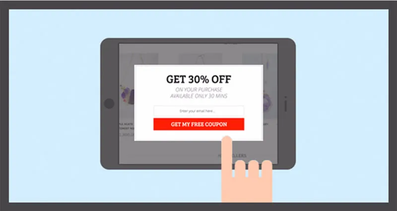
So, what can you do to get them to stick around on your website and automatically convert into customers?
However, it is not possible to convert 100 per cent of your visitors (as website visitors are often very skittish creatures and some of them are only “window shoppers” who have no intent to buy at that particular point of time). But, it's certainly possible to turn a good percentage of those visitors into subscribers (so that you can recapture them with your marketing messages and encourage them to come back) as well as convert few of them instantly.
Here's a three-step action plan to improve the conversion rate you’re getting today before your visitors bounce off your website permanently.
Show opt-in pop-up to your first-time visitors
Capture visitors attention the moment they land on your website.
According to data by Tony Haile of Chartbeat, 55 per cent of visitors spend fewer than 15 seconds on your website. So, it’s better to capture their attention the moment they land on your website so that you don't miss the chance to capture their email ids.
Why to use opt-in popup
With people surfing the web all day long, they discover new sites regularly, visit them, but most of the time forgets about them (it's not that they disliked your website, it's just that they weren’t able to remember it). It's more to do with their attention span and the infinite options available today.
But, an opt-in popup will capture the attention of your visitors the moment they land on it and will help you to successfully capture your visitors' contact information. A statistics by CrazyEgg states that opt-in pop-ups drive 1,375 per cent more subscribers than sidebars.
Here are two examples of opt-in popups with and without offer:
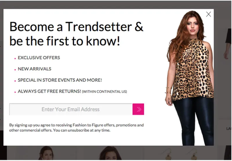
Opt-in without offer
This popup from Fashion to Figure clearly highlights the benefits of subscribing to their email list.
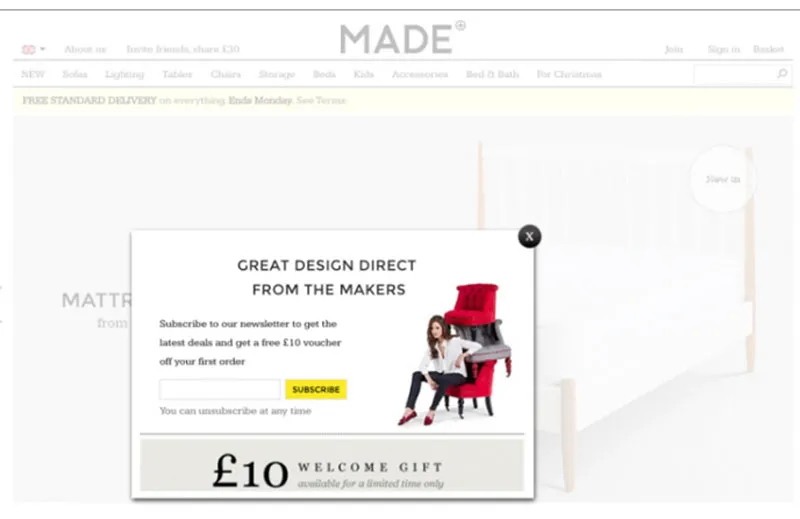
Opt-in with offer
This popup from Made has clearly highlighted the welcome offer to get more email sign-ups.
TIPS:
Have a neatly designed popup that doesn't look like an advertisement and has a strong CTA.
Don’t show an opt-in pop-up to visitors every time they visit your website. Use cookies to prevent this from happening by setting the number of times the same visitor can see your opt-in. Also, pre-determine the time gap when the popup will show up so that it doesn't pop up in your visitors' face. Showing it too frequently will also annoy your visitors and will force them to leave your website.
A/B test your popup size, type (overlay versus lightbox), timing and content (whether it's the benefits you're talking about or convincing them to give you their email).
Use exit-intent popup to pull back your leaving visitors
If you don't want to show a popup as soon as the visitors come to your website, then you can go for an exit-intent popup. As the name defines, they appear only when your visitor is about to leave the website. Exit-intent popups are your last chance to grab the attention of visitors before they are gone. So, instead of spending your time and resources to bring them back on your website, these popups help you make the most of it while the visitors are still on your website.
Remember, people are more conducive to online browsing than buying. That means if you want them to buy from your website you should entice them to do so.
Why to use an exit-intent popup
People hate popups and if you are also one of them, but still want to give it a shot you should start with an exit-intent popup. This helps in two ways: firstly, you can target your visitors and increase your conversions; secondly, you can do this without the risk of annoying them as they're already leaving the website.
A good way to use both opt-in and exit-intent popup is to use opt-in for collecting email address, while showing exit-intent when a visitor has done some activity, like has added items in his cart, and is leaving your website without completing the purchase.
Here is an example from Rock.com:
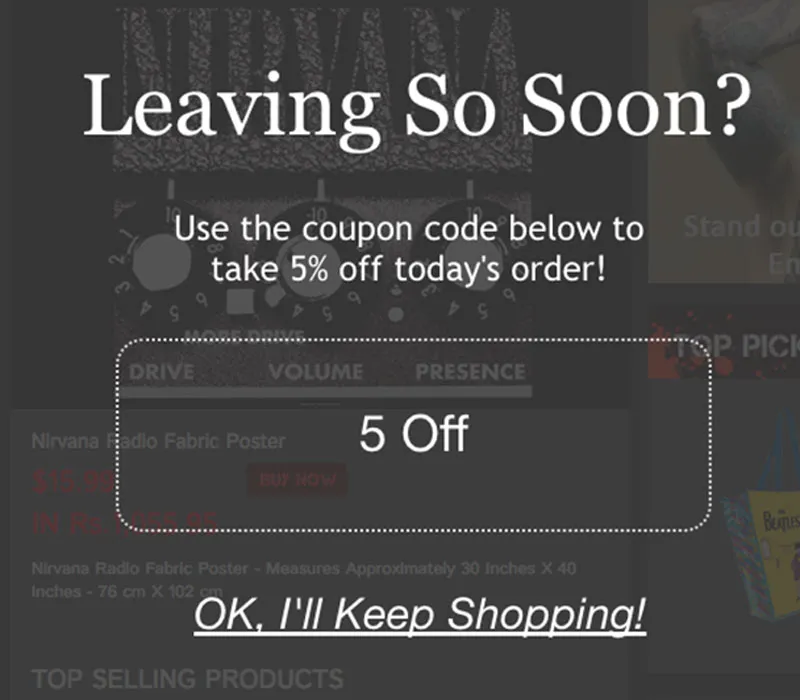
TIP: If you want to capture the attention of your leaving visitors give them an offer they can't resist. The more targeted and personalised your offer is, the better the chance that the visitor will convert. And as you have a very limited real estate in a popup, the headline and call-to-action play a significant role in piquing their interest.
Show welcome back popup to repeat visitors
Popups are not all about capturing email addresses but can be effectively used to engage your visitors.
The deepest principle in human nature is the craving to be appreciated – Williams James. And your visitors are no exception. So use welcome back popup to show your repeat visitors that you recognise them and increase their liking towards your website.
Why to use welcome back popup
A welcome back popup is a different point in the customer journey. These popups keep the visitors engaged and show them relevant recommendations based on the products they have added to the cart on their last visit, but didn’t buy. This way you can jog their memory and entice them to complete their purchase.
And, since these popups are based on the past actions of your visitors, they’re highly personalised and relevant to them. So there is a very less chance that they will find them annoying or intrusive like other popups.
Given below is an example from Zales:
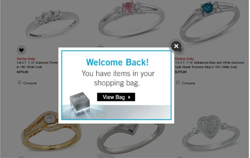
TIP: Make sure you've stored your visitor’s carts if you're asking them to go to the cart page.
Final thoughts: Simply using popups is not enough to guarantee more opt-in and conversions. Make sure you're providing value to your customers so that they don't see it as an interruption. Be consistent with your branding and design nice popups to build credibility. You only have a few seconds to capture their attention before they hit close.
All the above popups could improve your customer experience and conversions, but don't forget to test them separately to find out what works for you, and use the data to optimise them to get the maximum conversions.
(Disclaimer: The views and opinions expressed in this article are those of the author and do not necessarily reflect the views of YourStory.)


