How Indian e-commerce companies are using their first lifecycle email
Welcome emails are extremely important. It’s the first message which a new subscriber receives from your brand, so it's a great opportunity for you to create a great first impression and make it count. If you offer an amazing experience to them now, your brand will remain top of mind and you've more chances of converting these subscribers into customers.
According to the stats, subscribers who receive a welcome email show, on average, 33% more long-term engagement with that brand.
We recently analyzed welcome emails from some of the top e-commerce companies in India, such as Jabong, BlueStone, BigBasket, Caratlane, FabFurnish, Nykaa, Urbanladder, FirstCry, Snapdeal, and Koovs. Our goal was to understand how well these companies are using the first email from their lifecycle email series.
Now, before I start telling you the things these companies are doing right and a few things which they’re missing on, let me tell you some essentials which make an ideal welcome email.
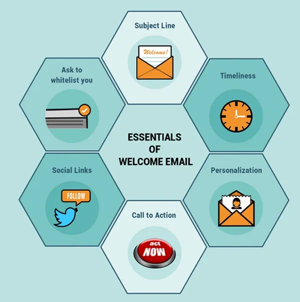
- Subject Line
Subject line plays a very important role in email marketing, so getting it right is crucial for your email success. To get your welcome email read, keep the following points in mind:
Include your brand name either in the sender's name or in the subject line of the email to let your subscribers know who the welcome emails are from
Clearly tell what the email is about in the subject line
If you have their first name, use it to personalize the subject line. For example, this is the subject line I got from Mixbook - "A welcoming gift for you, Reshu!"
Tip: Use A/B testing to find out whether your subscribers like first name personalization in the subject line or not.
- Timeliness
74.4% of consumers expect a welcome email when they subscribe. Your subscriber is the most engaged at the time of signup, and soon after, so the quickly you send it, the better the chance that people will check it. Even a delay of 30 minutes may be enough to lose the attention of new subscribers and will defeat the purpose of trying to place your brand on top of mind.
Tip: Schedule your welcome email soon after someone signs up on your list.
- Personalization
Personalization works wonders, it's a great way to engage people and make them feel special. You can personalize your welcome email by using first name, location, gender, and subscriber's pre-signup browsing data like the categories he has browsed etc. if you have collected the data at the time of sign up.
Tip: If you’ve not collected much data, add some simple personalization like addressing people by their first name to give it a nice touch.
- Call to action
When it comes to email marketing no email is complete without a CTA, it’s the most important aspect of your email. It can be anything depending on the action you want your subscriber to take, but it should be clear, prominent and focused. Remember, every email should have a clear call to action and your welcome email is no exception. You should always tell your subscriber/customer what you want him to do next. So, even if everything about your email is impressive, including the subject line and content, but if your customer is not able to figure out the next step he needs to do then you will fail in providing him immediate value.
Tip: When creating a CTA, keep in mind that it should not only be easy to spot, but easy to act on too.
- Short & informative
No matter how big and known your brand is, it’s not necessary that your potential customers know everything about it, so you should use your welcome email to bridge this gap. But, at the same time you should avoid information overload, and should keep it short and simple to get better results.
Tip: If you’ve too much to tell, create a welcome series rather than trying to cram everything in just one email.
- Social links
Adding links of your social accounts in your welcome email is a great way to promote your social platforms, as it gives you a chance to expand your community and connect with your subscribers on the social media platforms they actively engage on.
Tip: Instead of including links to all your social profiles in the email, include the few major ones you will daily engage on.
- Ask new subscribers to whitelist you
Not every time and every single email gets delivered into inbox, if you want your emails to land every time in your subscribers primary inbox encourage them to add you into their address books in your welcome email, to ensure future deliverability.
Tip: Ask people to whitelist you in your pre-header. This increases the chance that people will see your request, and this way your pre-header space will be utilized effectively too.
Now, let's quickly jump on to the welcome emails from my inbox:-
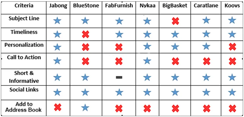
- Jabong
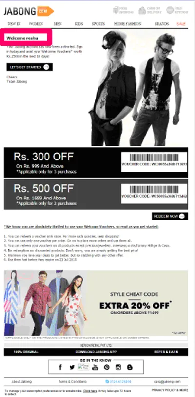

Jabong's welcome email is simple and to the point. Here are few good things about it:
- I can clearly identify who it's from before I opened it
- It addressed me personally and clearly tells me what is in it for me (welcome vouchers)
- I received it within ten minutes of my sign up, so Kudos to Jabong!
- They've utilized their pre-header space by highlighting their key policies thus addressing trust issues as a new user I might have before I go on to make a purchase
- This email has two call to action and both stands out. The CTA content, “Let’s Get Started,” and “Redeem Now” inspire recipients to act. Also, they've promoted all of their social accounts in it
Here’s what Jabong is missing up: Though they've not wasted their preheader by showing random stuff but they have used it to show the highlight the same information they ahve in their header. Instead of wasting their real estate like this, they could have used it to ask subscribers to add them into their address book.
- BlueStone
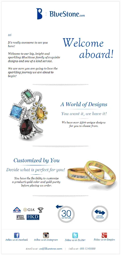

BlueStone's welcome email is short and elegant. Here are few good things about it:
- The sender name is clearly identifiable and the subject line is welcoming and simple.
- They've effectively utilized their preheader space by asking new subscribers to whitelist them so that their emails won’t land in contacts spam boxes.
- In addition, they've effectively utilized the footer of the email to promote its social accounts.
Here’s what BlueStone is missing up: A prominent call-to-action button should be the part of every email to take the customer back to the website, but they've missed on that one. Also, they've missed the opportunity to greet me personally even though they've taken my first name at the time of sign up. They missed the mark on timeliness too as they haven't sent me the email within first sixty minutes.
- FabFurnish
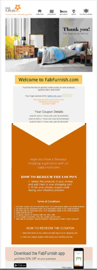

This email from FabFurnish is too long, but it does a few things right:
- In terms of subject line, FabFurnish made me open its email immediately, with a clear proposition.
- They clearly know how to use images to showcase their products.
- They've promoted their mobile app in a very good manner which is great as most of the people check their emails on mobile phones. Experian stats suggests that 53% of total email opens occurred on a mobile phone or tablet in Q3 2014
- Also, they rank high on timeliness as I received the email within moments of signing up
Here’s what FabFurnish is missing up: They haven't given a personal touch to this email. If you've gleaned information at the time of sign up you should use it. They could have added a little personalization to the message by adding my first name in the copy like "Thank you, Reshu!" instead of just saying Thank you! or "Welcome to FabFurnish.com, Reshu!" instead of Welcome to FabFurnish.com, to give it a nice touch.
* The email is too long so have captured only half of it.
- Nykaa
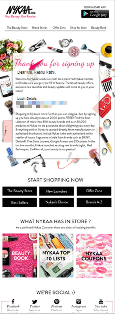

There’s a lot going on in this welcome email from Nykaa, from my login details, to what they offer, to what's in store, they've included everything in it. But, it still does a few things right:
- They've personalized the subject line as well the salutation of the email, though it would have been better if they would have just used my full name without adding (Ms.) title to it
- They ranked high on timeliness too and they've sent me the mail within a minutes of signing up
Here’s what Nykaa is missing up: They've not utilized their preheader space effectively. Instead of adding my name and login details in it, they should have used it to encourage me to whitelist them.
- BigBasket
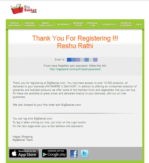

This email from BigBasket is straightforward and short. Here are a few good things about it:
- The navigation bar in this email is same as their website which is a good way to make subscribers aware about their entire product proposition
- They've personalized the copy of the email with my first name
- They've also utilized the footer space effectively
Here’s what BigBasket is missing up: No call to action, no attention to the subject line as well as preheader.
- Caratlane
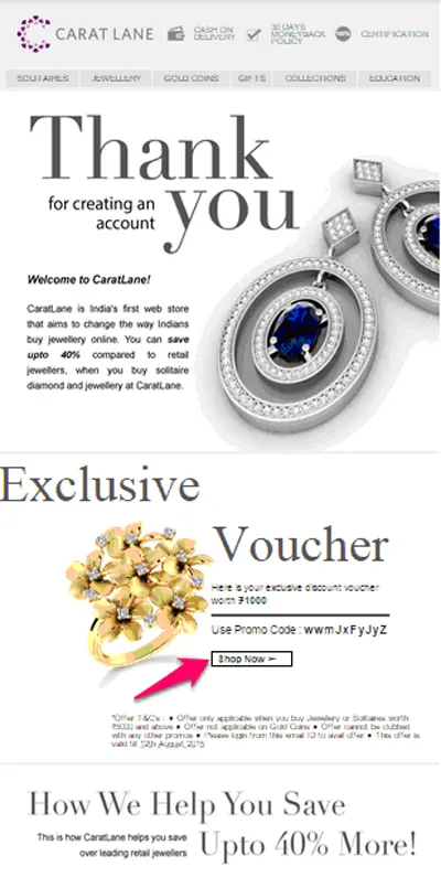

This Caratlane email is elegant and has a visually appealing design. Here are few good things about it:
Personalized subject line, effectively utilized preheader space, beautifully used images to showcase their products.
Here’s what Caratlane is missing up: As I mentioned earlier why to use yourpreheader to highlight information which you've already highlighted in your header. Instead, they could have used it to highlight the free vouchers inside. Also, their call to action can easily be missed.
- Koovs
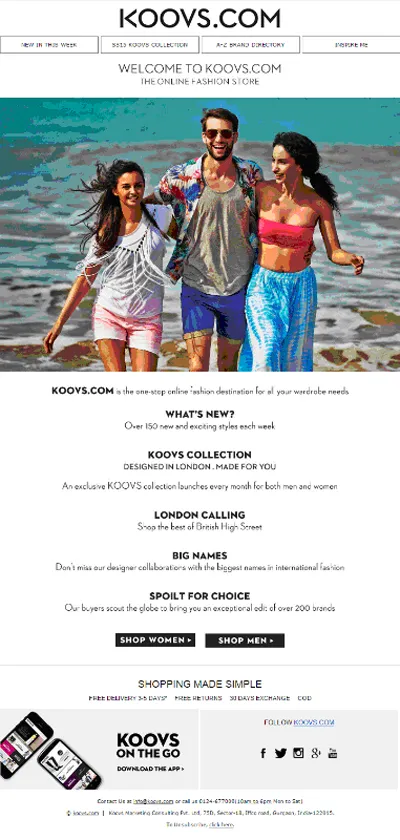

This email from Koovs is same as the sign up form on their website, even the CTAs are also the same. That's meh! Why bother sending a generic welcome email at all? Each email in your email marketing arsenal should work to get the readers a bit more invested in what your brand has to offer. But here's what they did right:
- Timeliness (received it within sceonds)
- Effectively utilized the footer space
Here’s what Koovs is missing up: lack of personalization and the big blunder of not highlighting their welcome offer as promised in their sign up page! Now, that's some serious disappointment & as a subscriber I feel cheated & tricked into opening this email.
And, I didn't received a welcome email from UrbanLadder, FirstCry, and Snapdeal in the first 48 hours (and still counting), so I guess they won't be sending me any.
Your welcome email isn't a mere greeting, its your chance to get your subscribers excited to receive your future emails and it should also have a quantifiable goal for your recipients. It could be to get N% of new subscribers to use the welcome offer and make a purchase or download your mobile app etc., or set the course of your future emails by getting them to share their preferences, depending on your goals. Just remember, you've worked hard to get them on your site, show them some appreciation and engage them from the very start.
(Disclaimer: The views and opinions expressed in this article are those of the author and do not necessarily reflect the views of YourStory.)