Housing plans to go global, launches new logo
Companies work hard to build a reputation and a brand identity that they hope will make them easily recognizable to their consumers (or clients). While building a brand is not easy, re-branding and creating a new identity for your enterprise can be even more challenging if not done right.In the recent past, Airbnb had changed its logo and had received mixed responses, Zomato changed its logo, not once but twice, the second time after acquiring UrbanSpoon.
The Indian real estate sector has been buzzing with a lot of activity recently. Common Floor acqui-hired Bakfy and launched its VR product Retina, Grabhouse raised $2.5 million from Kalaari Capital and Sequoia Capital etc. Housing has now come out with a new logo and has redesigned its website and mobile app and is planning to go global.
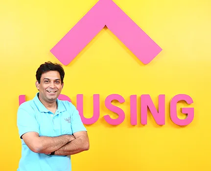
YourStory spoke to CMO Pratik Seal and CFO Azeem Zainulbhai of Housing to understand the strategy behind such an exercise.
Context
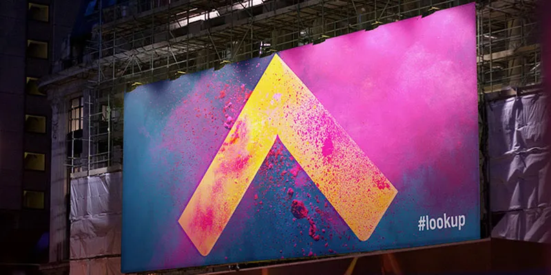
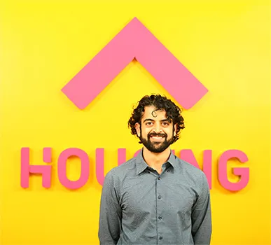
With Holi, the festival of colour and happiness, around the corner, Housing has come out in a new avatar with a colour palette in their new logo and wordmark. Christened as 'Housing Pink, Yellow, Purple and Green', Housing aims to personify or project itself as an optimistic, game-changing and uncompromising entity.
“The real estate market has a lot of pessimism. Finding a house is supposed to be a good experience, but more often than not it turns out to be a bad experience. We want to give customers a better experience and change mindsets,” says Pratik. “The whole idea of this initial marketing campaign is to not just sell but build a deeper relationship with our customers,” he continued.
The new identity explained
Summed up in two words ‘Look Up’, Housing’s new logo is shaped like an upward arrow, with sharp outer edges that direct towards the future, while the softer edges symbolize a nurturing shelter. The ‘Look Up’ symbol is embedded into the letter ‘H’ of the Housing logotype.
"There were many choices and ideas on the table but all the discussions led to this one naturally. The new logo and brand is a natural extension. There were no hard decisions involved in the selection," says Zainulbhai.
Housing feels that everything connects seamlessly with their 'Look Up' symbol. They consider it a visual language of illustrations and photography of buildings and everyday objects. The symbol locks up with the apex (90 degree) of the photograph to create branded communications. As a visual signature, ‘Look Up’ symbol and Housing logo type became flexible to accommodate/house content, photographs, messages or any communication within it.
The process
To launch this new brand identity, Housing partnered with Moving Brands, a global creative company in March 2014. The two companies had workshop sessions and many conversations to understand what Housing was looking for and to get to the heart of the matter.
Slowly, the more they talked about, the more they realised the true ingredients of Housing’s identity and backstory. The goal was to distil Housing’s brand behaviours and values into a simple, memorable and powerful expression for themselves and their consumers. ‘Look Up’ resonated strongly with Housing and Moving Brands and they took it further.
“Moving Brands spent a lot of time with us and were able to understand our story. From day one they were interested in us and what we do and we feel it has come out in our new avatar,” said Zainulbhai.
Housing has promoted their brand re-launch across social media channels through Youtube and twitter promotions. They are planning to take this offline in the near future as well.
Roadmap
Housing came at a time when consumers were dealing with many challenges while buying or renting a house. It was with the objective of helping consumers overcome these hurdles that Housing created a map-based platform with 100% verified listings and real photos.
Commenting on the launch, Rahul Yadav, CEO & Co-founder of Housing, said, “We strive to improve, explore and ask ourselves ‘what next?’ so we can set new benchmarks, change the game and make every customer experience 10X. In short, we Out See, Out Think and Out Do for our customers so that they can look up to us and to a better life. Our new identity is a reflection of this belief system.”
With the re-branding complete, Housing now plans to map 24 lakh houses in all metro cities and bring properties to 10,000 towns and villages. They are also planning to accelerate by 10x to grow further and establish themselves as a global brand.
"Though I can't reveal our exact global growth plans, we are planning to go global and enter emerging markets in the future, but before we take that step we will win India," adds Zainulbhai.
Website: Housing
What do you think about the new logo and design? Do let us know in the comments


