Tired of reading long gadget reviews? ‘Gadget Adda’ has a solution for you!

Passion for technology drew the two engineers, Apoorav Gilotra and Prateek Gambhir, to add something new to the gadget start-up space. Tired of reading inadequate and overtly lengthy reviews, the duo were adamant on utilising their skills and coming up with something unusual.
Last year, they started their bootstrap venture, ‘GadgetAdda’, which is a tech centric-publication with a focus on delivering simplified and visual version of gadget information. “The thought was clear, we wanted to focus on gadgets and technology and it was to be a gadget’s hub - a place where those interested in the domain can find desired information, interesting articles, discuss and share their passion, and hence the name ‘GadgetAdda’,” says Apoorav Gilotra.
‘Adda’ being a Bengali word for ‘a hang out place’, they aim at becoming the first priority adda for tech-freak readers and “for those who want the updates in a simplified form and hence the tagline- ‘Tech Updates Simplified’,” he adds.
Its inception and more
“Prateek and I met at our first workplace. The talks always included gadgets and it was clear that there is some passion in us when it comes to gadgets and technology. This led to the birth of GadgetAdda,” recollects Apoorav.

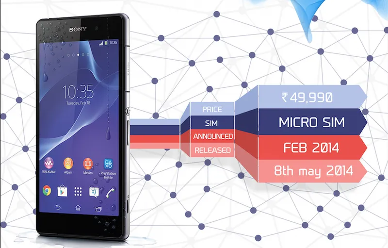
Apoorav being a techno freak and Prateek good at designing, the two decided to further innovate with the product they have created. Hence, they launched a new section named ‘GadgetReviews’ to present reviews in infographics where all the information about a product will be displayed in an interactive manner.
“The content presented is simplified and easy to understand in a quick go with the help of icons used in it. For example, if a reader wants to quickly check out the specifications of a smartphone, it becomes easy in 'GraphicReview' as it has an icon dedicated to each specification which can easily catch the reader's eye and make the process quick as compared to seeing them in detailed tables,” says Prateek Gambhir.

After analysing considerable reviews from readers and random Delhi metro travellers, they got a fair idea of what their target audience looks for before buying gadgets. “Something represented graphically stays in the mind for a long duration compared to what the reader retains after reading some lengthy text. And that is how, we gathered points on what all a reader looks for and came up with GraphicReviews. We are ourselves amazed looking at what our first GraphicReview draft was and how it is today after 'n' number of iterations,” says Apoorav.
‘GraphicReview’ section
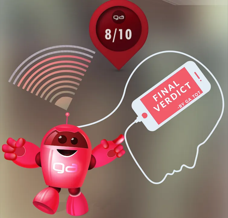
It involves reviews in a graphical layout to help readers retain the positives and negatives of a product. “ We are a team of six. For developing content, we make sure that it is well-researched, suited to the reader, using graphics and presenting it in such a manner that a reader could understand it in the first go. After in-depth analysis, our mascot GA ToT gives the final rating for all the devices that we cover under GraphicReview,” says Apoorav.

The following information about a product is illustrated in the sections:
- Launch date and price
- Specifications
- Features
- Pros and Cons
- Benchmark tests
- Area wise rating
- GA ToT rating
“At present, we are doing GraphicReviews for selected smartphones. Moving forward, we aim to cover majority of the smartphones and then use the analytics and feedback to understand what more/less the reader wants out of it,” says Apoorav.
Journey so far
In their journey to explore this style of review presentation and having received a positive feedback by far, they feel motivated and believe to have come a long way from where they started.
“Coming from Computer Science engineering background, we put in a lot of effort to bring out a clean website without any messy content. Although, the website now looks entirely different from what we started, but we learned a lot of HTML and CSS stuff on our way,” says Prateek.
“For me the key moment was when we first hit 1000 unique users a day mark and then 2000 in a few days and so on. The learning there was how to keep it consistent and it really is a tough job in the content field,” says Apoorav.
Visit the site here.


