Designing For Power Users (Part 2)
Last week, I wrote about the tradeoffs that are needed when products "grow up". Basically, after your product has gather its initial set of (hopefully loyal) users, you will have a choice of whether to design the subsequent iterations for the "power users" - The set of users that have become familiar with your product and are now looking to get more out of it, vs designing for "new users", who are just getting on-boarded.
Last week, we looked at an example of a product designed for the power users, but this week, lets walk through a product that is designed for novice users, and doesn't necessarily address the power users. There have been a few interesting examples of this in the past few years from the startup world, especially around email.
Gmail and Outlook have been the dominant web and desktop email clients for the longest time, but you can argue that they are designed for the power users. They have tons of features and shortcuts, several of them prominent, but many hidden, that make users using them super productive. And because the volume of email that an average user gets has been increasing, the argument can be made that more and more productivity tools are needed to deal with email.

However, some startups went the other direction, and tried to think of what would be a way to simplify the email experience, rather than create tools for handling complexity. One example of this is the Mac email client called Sparrow. The sparrow email client's goal was to super-simplify the email experience, and get users to actually spend less time with email (which is strange if you think about it - Wanting users to spend lesser time using your product). The product was so successful that it got quite a bit of traction, and eventually was bought out by Google.
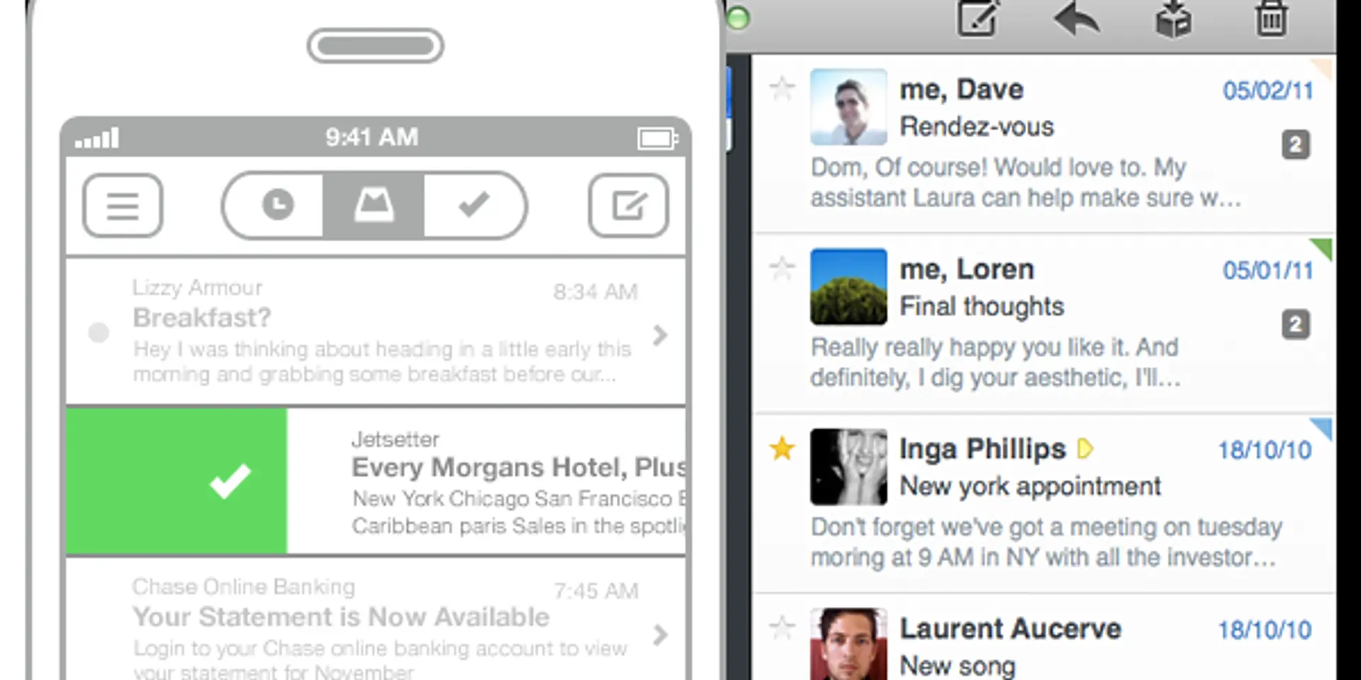
Another recent product that launched was an iOS app called "Mailbox App". The designers of this app wanted to simplify the email paradigm. Email is used for all sorts of overloaded purposes. As a communications center, notifications from banks and other institutions, making plans with friends and much more. This app decided to focus on a very simple, very narrow definition of email - As a TODO list manager.
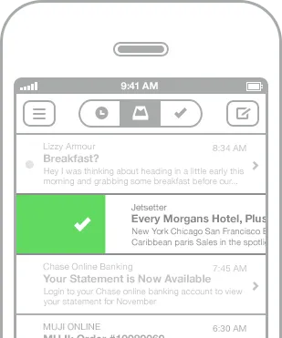
The app treats your inbox like a TODO list, so you can "check off" emails and "set reminder" for an email for tomorrow for example. This app also was dead simple to use. It cut down on a majority of features of your standard email client, and focused entirely on a simple use case. This app was also very successful, and within weeks of launch, Dropbox acquired this app.
The point is that you have to make a conscious choice of where you want your product to go. You can make a very successful product (and tons of money) in either direction, but you have to be committed to it, and consciously design either for simplicity and on-boarding new users, or make a power-tool to increase productivity of your user base.